Over the past two decades, we've studied DAM usage across more than 250,000 businesses, from mom and pop retailers and franchisees, to the in-house agencies at some of the best known brands in the world.
During that time, we've seen systems that achieve phenomenal satisfaction and almost instant user adoption. We've also seen DOA DAMs that got shut down without ever being launched for their intended user communities.
Along the way, we've developed a number of quick and easy tests that help us to determine if a company's DAM is on the path to success or if it's in the early stages of a flameout.
We hope these simple tests, which you should be able to conduct using basic DAM Reporting tools, can help you to improve adoption and respond effectively if your DAM is in need of a course correction.
Test #1: Ratio of Active to Registered Users
This is the most basic test of user-adoption, and when I first began building SaaS based marketing systems, I assumed it was conducted frequently—even automatically—by most DAM managers.
Bad assumption.
The reality is that managing the DAM is usually just one of many responsibilities that DAM champions have on their plate. As a result, DAMs can sometimes live with low levels of adoption for months or even years at a time without the problem being detected. During that time, alternate solutions (Dropboxes and shared-drives, and Pinterest, oh my!) begin to spring up, siphoning off more users and further detracting from the DAM's critical mass. What you end up with is what I think of as the DAM death spiral.
So, how do you nip the problem in the bud?
First, on a weekly basis, measure monthly active users (MAU), quarterly active users (QAU), and annual active users (AAU) against your registered user base. If your DAM has modern reporting tools, this should take less than a minute and will yield a simple statistic that you can trend-track over time.
Using a simple traffic-light grading system, here's how to analyze your very simple test results.
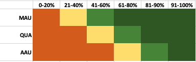
If your results are coming in dark green, action isn't required.
If you're in the light green zone, it's good to set aside some time for a little user-level investigation. It may be that recent uploads and template installs aren't serving the immediate needs of your user community and a content refresh will help.
You'll note that the yellow caution zone is the smallest on my rough-and-ready chart. That's because this represents the adoption tipping point where lack of use begins to feed on itself. If your results are in this zone for quarterly or monthly periods, you need to act with urgency (and should plan on devoting a substantial amount of time) to reverse course.
(In an upcoming post, we'll talk about the most common causes of usage downturns at the monthly and quarterly checkpoints. )
Test #2: Asset Freshness
By default, most DAMs will display assets in chronological order with the most recently uploaded assets appearing first. This gives DAM managers a great opportunity to keep the most important screen—default search results—refreshed with new assets on a daily or at least weekly basis.
To assess your DAM's apparent freshness, compare the frequency with which your average user visits the system, to the frequency with which new assets are uploaded. If the average user's visit frequency is much greater than frequency of upload, it's time to stage your release of new assets in an effort to improve the number of times your typical user encounters fresh assets.
There are two steps to this test.
- Gather the number of user sessions for a given time frame, and divide it by the number of active users over that same time frame. This yields average visit frequency.
- Gather the number of upload batches executed over that same time frame.
- Divide #1 by #2. If the result is greater than 3, consider either increasing the number of assets you provide for the user community, or uploading assets in a larger number of smaller batches to ensure.
The mistake we see DAM managers making time after time is uploading large batches of assets with the primary purpose of maximizing their own efficiency. In many cases, this can create a "dump" effect that makes newly uploaded assets harder for users to find, examine, and use.
Test #3: Asset-Template Balance
The typical DAM these days does a lot more than store and distribute static assets. Modern DAMs are now serving as versioning workshops as well, where users can create customized versions of assets to meet their immediate, local needs.
From a user adoption point of view, you'll want to assess the extent to which customizing activity is balanced with static download activity. The blend will vary from one brand community to the next, and even from one time period to the next. But in general, you should aim for a 70/30 split.
Split in which direction? Surprisingly, it doesn't seem to matter much. Some brands emphasize the static side of the equation; others lean toward document versioning. Both types of user communities seem to succeed well. The key is to foster a balance. Time and again, our data show that balanced systems drive deeper roots into the culture and deliver greater ROI over the long haul.
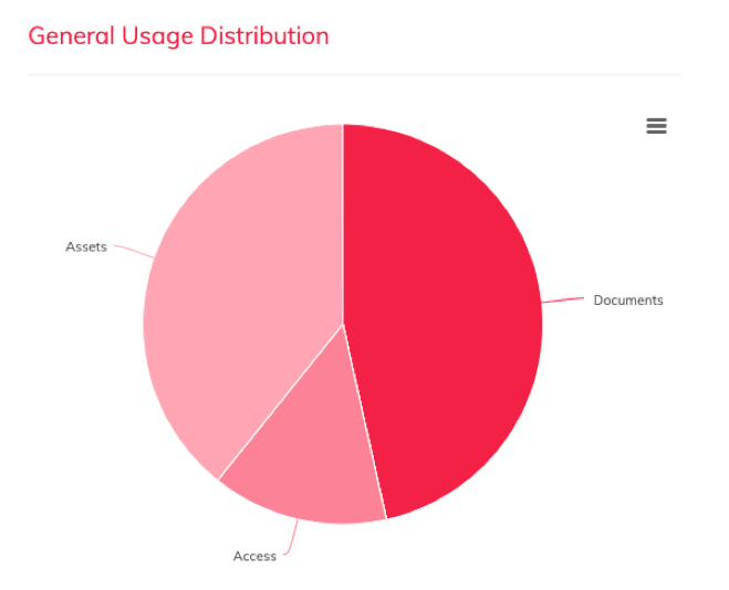
The chart below shows the distribution of static asset downloads and dynamic document generations in an enterprise DAM that enjoys widespread and longstanding user adoption. Note how the number of sessions over the time period is much smaller than the total transactions—this indicates that users are getting value each time they visit the DAM.
Test #4: Page-Views to Transactions.
It stands to reason that a DAM that delivers solid results for each and every user visit will earn greater adoption and satisfaction over time. But how can you tell if your users are actually getting what they need?
Here's a simple test to answer that question. Just divide the number of page views on your system by the total number of meaningful transactions (downloads, plus document creations, etc). If the ratio of page-views-to -transaction is less than 10:1 you're probably doing OK by your users. If the ratio is under 5:1, much better. And if you can find a way to get the ratio to 3:1, you've got a system that's making the most of every visit, and that's probably earning rave reviews, even if you don't get to listen in on those user-to-user conversations.
Whenever I talk through this point with DAM managers, they tend to ask why I don't put more stock in user surveys. The fact is, I love user surveys, but have two caveats about them. First, they consume time that's better spent building their actual businesses. And second, I often find that internal surveys can elicit a sympathetic response from users, because they know who their DAM managers are and don't want to be the ones to say that anything is falling short. By contrast, a mathematical ratio like page-views-to-transactions tells you instantly whether your information architecture and asset tagging are up to snuff.
Test#5: Support Tickets-to-Transactions
This test is so obvious, it almost seems like it's not worth a section in this blog post. But I am repeatedly amazed by how often DAM managers don't measure their ticket-to-transaction ratios. Sometimes, this is because support comes from a third-party vendor, and so the ticket counts aren't readily accessible. Other times, it may be because the internal Help Desk doesn't separate out their DAM support tickets from everything else. But over the years, I have consistently found that this is the true "canary in the coal mine" statistic. So, it pays to work with your vendor or your IT team to get a regular count on tickets and to do this simple analysis.
Of course, at first the number won't tell you much, until you've established a natural baseline for your user community. But once you know what that baseline is, you'll find that sudden spikes reveal something that's usually actionable. It could be a flaw in tagging or organization of a recent batch upload. It could be a sudden deficiency in infrastructure, or perhaps a change in the enterprise SSO. It might even be a sign (as we have seen recently) of a change in user browsing habits.
But no matter what the circumstance, the ticket-to-transaction ratio is your finger on the pulse of the system—and one that, unfortunately, some DAM managers ignore until it's too late.
Free Health Check Calculator
If you'd like to get a free health check on your DAM user community, click here to register for our Health Check Calculator.